An installation at MACRO – Museo d'Arte Contemporanéa di Roma
Curated by Luca Lo Pinto
AUTONOMIARTEPOVERARCHIZOOMEMPHISUPERSTUDIOPERAISMO
Summary
Information
Date
20 September 2023 - 18 February 2024
Location
Rome, IT
With
MACRO Museo d'Arte Contemporanea di Roma
Links
Format
installation, publication, essay
Words
Enzo Mari, Michelangelo Antonioni, Provo
Documentation
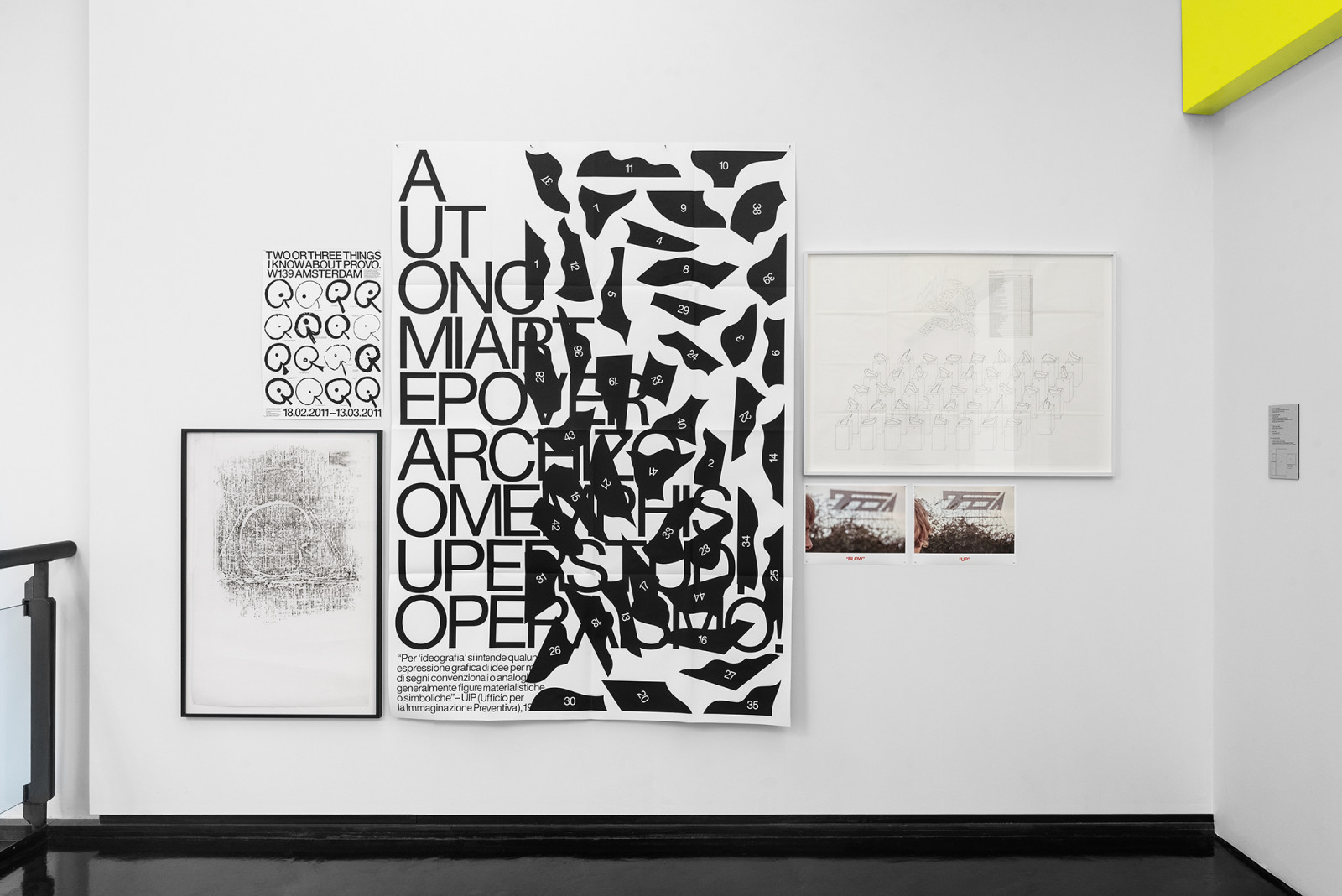
AUTONOMIARTEPOVERARCHIZOOMEMPHISUPERSTUDIOPERAISMO, Macro, Roma, 2024. Photo: Michela Pedranti – DSL Studio
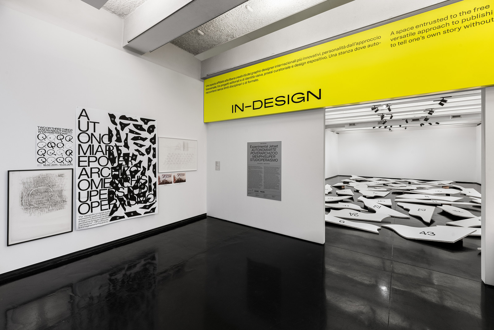
AUTONOMIARTEPOVERARCHIZOOMEMPHISUPERSTUDIOPERAISMO, Macro, Roma, 2024. Photo: Michela Pedranti – DSL Studio
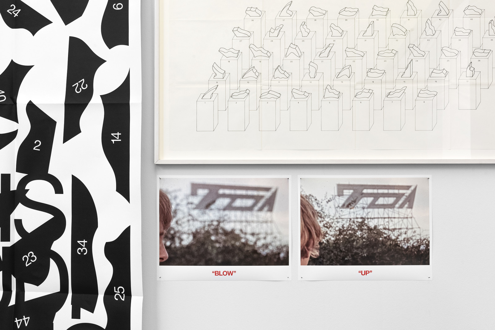
AUTONOMIARTEPOVERARCHIZOOMEMPHISUPERSTUDIOPERAISMO, Macro, Roma, 2024. Photo: Michela Pedranti – DSL Studio
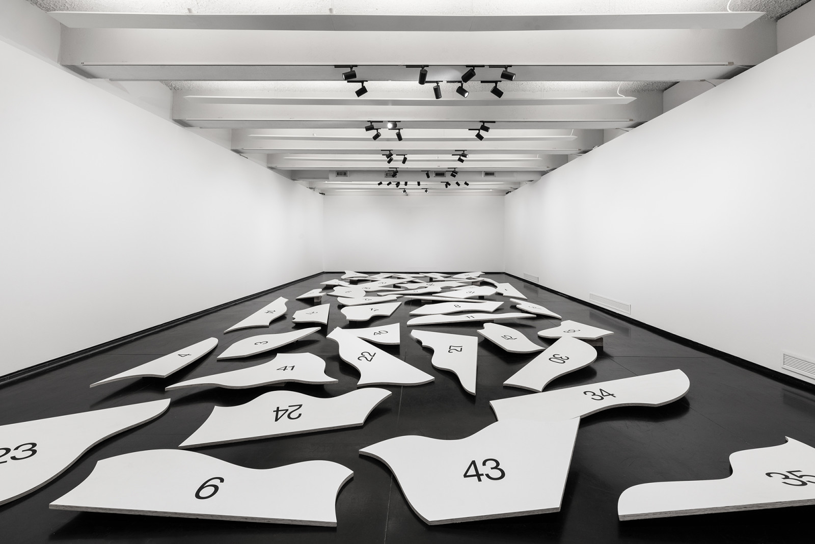
AUTONOMIARTEPOVERARCHIZOOMEMPHISUPERSTUDIOPERAISMO, Macro, Roma, 2024. Photo: Michela Pedranti – DSL Studio
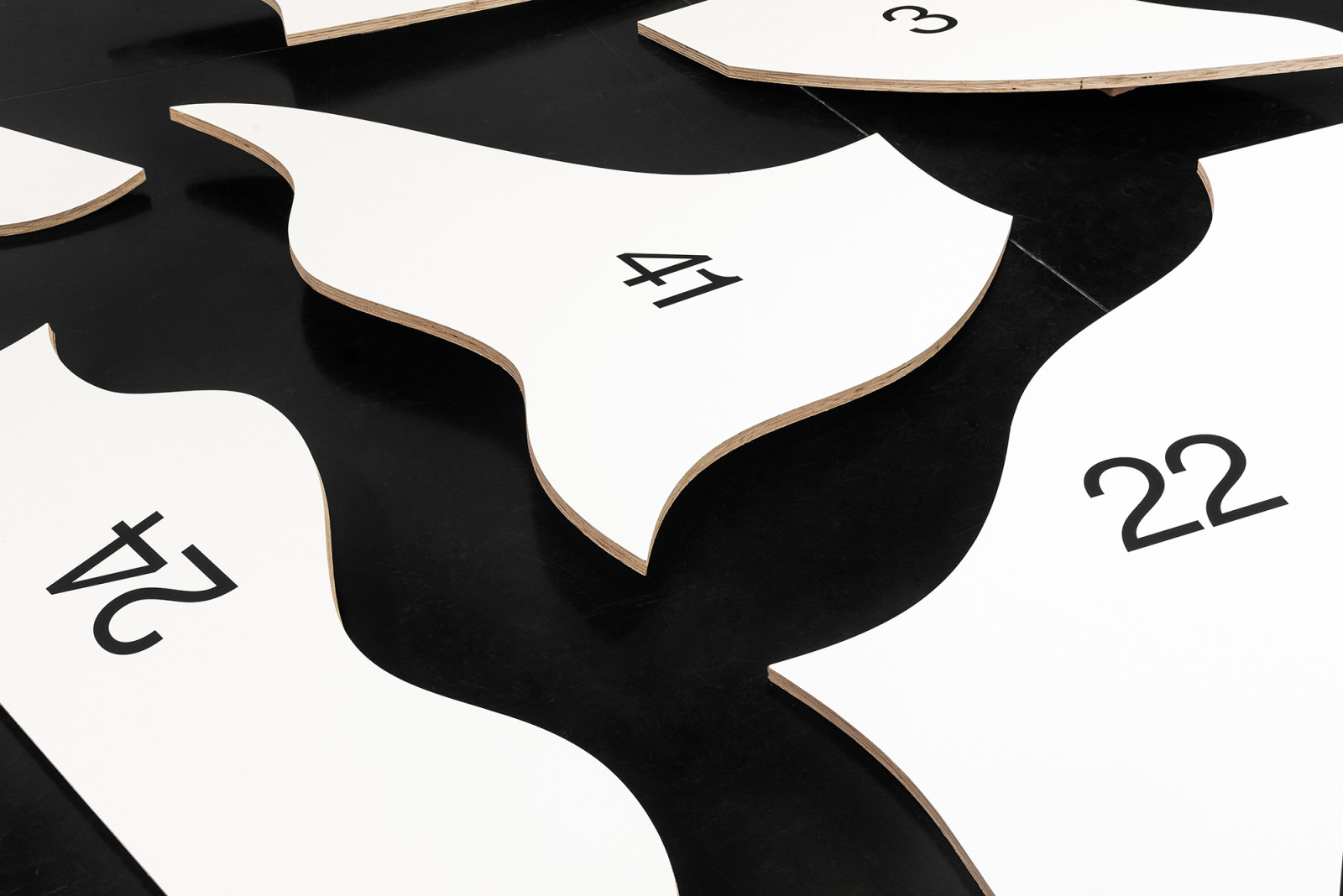
AUTONOMIARTEPOVERARCHIZOOMEMPHISUPERSTUDIOPERAISMO, Macro, Roma, 2024. Photo: Michela Pedranti – DSL Studio
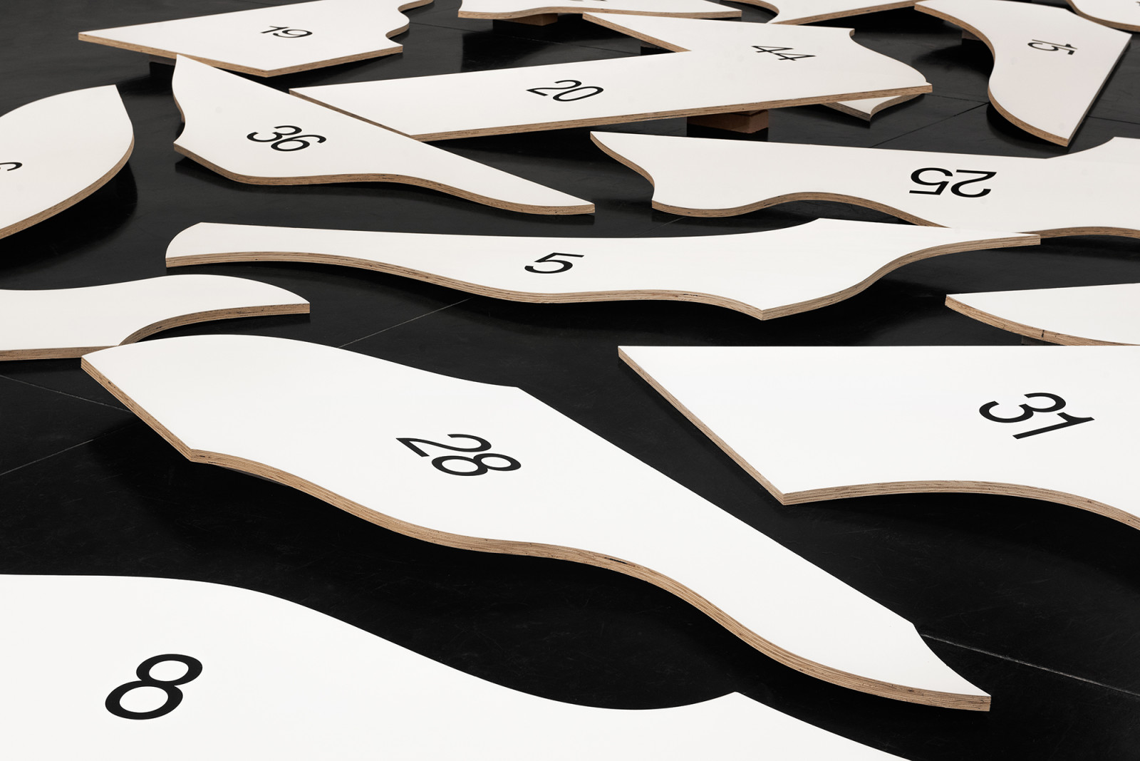
AUTONOMIARTEPOVERARCHIZOOMEMPHISUPERSTUDIOPERAISMO, Macro, Roma, 2024. Photo: Michela Pedranti – DSL Studio
Notes
Versions
Downloads
By “ideography” we mean any graphic expression of ideas by means of conventional or analogic signs, generally materialistic or symbolic figures...
– UIP (Ufficio per la Immaginazione Preventiva), 1975
1. A tale of two or three signs
While exploring one of the long-running themes within our practice (a theme that can be described as the relationship between the sign and the city), we felt compelled to also take into consideration a certain Italian context. A context that has always cast an almost magical spell over us – a spell that can be abstracted into a single slogan:
AUTONOMIARTEPOVERARCHIZOOMEMPHISUPERSTUDIOPERAISMO
Indeed, the notion of Italian “Radical Design” has always captured our interest – as have the many complex (and often paradoxical) relationships and connections between Italian avant-garde movements and the Italian Left. However, somehow we had to narrow down our subject and streamline our thoughts. And that’s when we realised that within this “Italian sphere” there were two signs (or, more precisely, two approaches towards signs) that we found especially interesting.
1.1
The first sign is the neon logo (or better said, non-logo) that can be found in Michelangelo Antonioni’s Blow-Up (1966).
This sign has always intrigued us. In literature on the subject of Antonioni in general (and on Blow-Up in particular), emphasis is often put on the “traumatic meaninglessness” of the sign.
For example, in our own copy of Seymour Chatman’s Antonioni, or, The Surface of the World (University of California, 1985), the sign is described as follows:
Here, the sign (which Chatman reads as TOA or FOA, while we’ve also come across scholars who interpreted the sign as the acronym MA, or more interestingly as depicting a gun or rifle), is explained in a somewhat structuralist manner, by way of Roland Barthes. While the sign is not signifying anything in itself (an uncertainty that Barthes describes as “traumatic”), the sign actually gains meaning through the role it plays in the movie. There’s no intrinsic meaning – it just gains meaning within the structure of the film.
It’s not important WHAT the sign means – it just matters HOW the sign means.
This idea of a graphic sign playing a specific role in a movie also brings to mind what Susan Sontag wrote in 1970 (in her essay “Posters: Advertisement, Art, Political Artefact, Commodity”), when she briefly observed that “in recent years, the eye of filmmakers has turned more and more to posters. They appear as magical, partly opaque references; think of the use of posters as key objects in almost all Godard’s films. They are cited as eloquent and exact sociological and moral evidence; a recent example is Antonioni’s tour of Los Angeles billboard fantasies in the early part of Zabriskie Point...”. Graphic artefacts, that are as magical and opaque as they are exact and sociological – there is a beautiful paradox here. We found the idea of the “non-signifying sign” extremely interesting – and worthy of exploration.
1.2
The second sign (within this “Italian sphere”) that we find interesting is the hammer and sickle, as deconstructed by Enzo Mari.
Enzo Mari’s ongoing investigation into the semiotics of the hammer and sickle is well-documented. A research project that already started 1954 (when Mari rendered the hammer and sickle “in the style of” Giotto), it involved a rigorous re-design of the symbol (1970), a maniacal multiplication of the symbol (1973), and finally a total deconstruction of the symbol (1977). The sign, broken down into forty-four isolated fragments, signalling the end of signification.
When comparing the two cases (the neon/non-logo in Antonioni’s Blow-Up, and Enzo Mari’s deconstructed hammer and sickle), you cannot escape the feeling that you are looking at two forces, moving in opposite directions. The Blow-Up sign is in itself meaningless, but gains meaning through the movie. The hammer and sickle symbol is heavily charged with meaning, but is freed of its burden through Mari’s deconstruction. In other words – on the one side there’s an “empty” sign that is being loaded with meaning (Antonioni), while on the other side there is a “loaded sign” that is being liberated of meaning (Mari).
Bringing these signs together (as in a collision) would certainly cause a heavy semiotic blast.
2. To design or to de-sign
Regarding Enzo Mari’s method of deconstruction, there exists a very intriguing quote by Mari, in which he states that “the breaking-down and modular re-organisation of images are at the root of my body of work, and my outlook on the world...”
This quote is taken from Mari’s Funzione della Ricerca Estetica (Edizioni di Comunità, Milan 1970), written around the same time as his work on the hammer and sickle.
What we find interesting about this quote (“the breaking-down and modular re-organisation of images”) is that it seems to perfectly chime (and rhyme) with what we once wrote ourselves about the word “design” – that it should be possible to read this word as “de-sign” (as in: un-sign, or non-sign).
As we wrote in 2013 (in an essay about the German Fluxus artist/designer Wolf Vostell):
We shouldn’t forget that the word “design” shares, with words such as “décollage”, “deconstruction” and “destruction”, the prefix “de-”. A prefix that is mainly used to indicate processes of reversal and negation. ( In fact, the Dutch word “ontwerpen” includes the prefix “ont-”, which is a similar way to express negation). So maybe it’s interesting to redefine “design” in the most literal sense of the word (the reversal, or negation, of the sign). Challenging the value of the sign, attacking the aura of the image – this can be seen as de-sign in its purest form.
In our writings, we re-visited this theme (“design” vs. “de-sign”) a couple of times after that, in slightly different variations. However, our intention always remained the same: to suggest that the word “design” (and thus “de-sign”) could refer to both constructivist and deconstructivist impulses. It goes without saying that we really recognise both these impulses (the constructive and the deconstructive) in the work of Enzo Mari.
And needless to say – the quote by Mari (“the breaking-down and modular re-organisation of images”) seems to perfectly describe the plot of Antonioni’s Blow-Up as well.
3. Against neorealism
What seems to connect Mari and Antonioni is their dislike of Italian neorealism (neorealismo). While both artists described themselves as Marxists, they grew wary of easy pamphletism, or populist social-realism, or obvious sloganeering.
In his 1972 manifesto “Hammer and Sickle. Three of the ways an artist can contribute to class struggle”, Mari writes explicitly that his project should be seen as “a reaction against the art forms in vogue during those years, in particular [...] neorealism”. He continues to explain that this is exactly the reason why he took, as the subject of his research project, the hammer and sickle: “a celebratory object like those produced by the neorealists”.
In other words – Mari tries to show that the political dimension of his project is not so much enclosed in the direct message of the hammer and sickle, but instead resides in the material methods in which Mari reproduces this symbol – through planning, research, and later even deconstruction. (In other words, Mari demonstrates that the political is not really enclosed in WHAT the sign means, but HOW it means).
The same can be said about Antonioni. In his early movies, he still followed the neorealist line – but he broke with this neorealism in 1960 (with his movie L’Avventura), and never looked back. He continued to consider himself a Marxist – but his Marxism deepened itself, and entered a more abstract, poetic realm.
Or to say it with Marcuse (in The Aesthetic Dimension, from 1977), it too entered an “aesthetic dimension”:
Art is not revolutionary because it is created for the working class or for “the revolution”. Art can be called revolutionary in a meaningful sense only with reference to itself, as content having become form. The political potential of art lies only in its own aesthetic dimension [...]. The more immediately political the work of art, the more it reduces the power of estrangement and the radical, transcendent goals of change. In this sense, there may be more subversive potential in poetry than in didactic propaganda.
This is a position we really admire, and recognise in ourselves. We also see our practice as political – but it is a political engagement that dwells in a more abstract, poetic realm (rather than in obvious and explicit political messages, or in positivist utilitarianism).
In fact, eleven years ago we wrote an essay about the Italian (indeed Roman) graphic designer Ettore Vitale and the posters he designed between 1973 and 1991 for the Italian Socialist Party (Partito Socialista Italiano, or PSI). As we argued in the essay (which appeared in issue 1 of the English journal EP, published by Sternberg Press in 2013), the real socialist content of these posters lies not necessarily in the explicit political messages, but in the graphic language of Vitale himself – his use of specific material techniques, or more precisely: the presence of graphic (almost Brechtian) methods within the posters.
These graphic methods (as employed by Vitale) include techniques such as folding, tearing, overprinting, and repetition. (In fact, come to think of it – the notion of the “blow-up” is also such a method).
4. Blow-Up, Zero, Zero Work
As an aside, we wanted to include some remarks about our ongoing fascination with the movie Blow-Up. In many past interviews, we mentioned our love for Antonioni’s film (see for example the fragments included in our monograph, Statement and Counter-Statement: Notes on Experimental Jetset, Volume 1, Roma Publications, Amsterdam 2015). Added to that – in 2007 we designed a couple of prints (as a contribution to a small group show), in which we explicitly referred to the movie.
In themselves, these posters are not so interesting. But we were suddenly reminded of these prints when we were recently reading Images of Class: Operaismo, Autonomia, and the Visual Arts (1962–1988) by Jacopo Galimberti (Verso Books, New York, London 2022). In this paperback, a few covers of the Italian Autonomist magazine Lavoro Zero were shown – and these covers (from 1975–76) show a very similar graphic effect (a gradual “blowing up” of imagery).
What’s interesting, as Galimberti remarks in Images of Class, is that a lot of these Autonomist magazines (including Zero Work, the English version of Lavoro Zero) were designed by artists who were originally part of Gruppo N, the Italian branch of the international Zero Group. So people like Manfredo Massironi, Alberto Biasi, Ennio Chiggio, and others, had interesting double lives: during the day (so to speak), they were fully devoted to total abstraction, and busy constructing Op-Art-like objects – while during the night, they were involved in the layout and typography of ultra-left magazines. It’s a fascinating compartmentalisation of skills, demonstrating two different (and seemingly opposite) modes of political engagement – the poetic and the practical. Either way – a lot of the members of Gruppo N were involved in the seminal traveling exhibition Arte Programmata (1962–1963), featuring a poster that brings us right back to the graphic theme of the “blow-up”.
The designer of the poster? Enzo Mari. So it seems as if the story really folds into itself here.
5. The whole and the fragment
Enzo Mari’s deconstruction of the hammer and sickle symbol is often regarded as a somewhat disillusioned, cynical gesture – as a work signalling “the death of ideology”. And sure enough, ten years after 44 valutazioni (1977), Mari created Allegoria della morte (1987), an installation composed of three similar gravestones, each carrying an engraved symbol: the hammer and sickle, the swastika, and the cross. The end of history as we knew it.
However, we do believe that the deconstructed hammer and sickle is ultimately a completely utopian work – each fragment carrying a revolutionary potential that’s more vital than that of the hammer and sickle as a whole. By being abstract, these fragments are freed from the tyranny of representation, and become pure objects, of themselves and in themselves. Floating signifiers, more capable of capturing the notion of utopia than any graven image (such as the hammer and sickle) can ever do.
This idea of a utopian potential to be found in abstract fragments also brings to mind the words of German philosopher Ernst Bloch (1885–1977), as formulated in Das Prinzip Hoffnung (1938–1947). Bloch insisted that although the utopian dream might have been shattered, fragments of utopia can still be found in art and popular culture: in architecture, dance, fashion, music, film, travelling, jokes, fairy tales. Each of these fragments contains a utopian potential, a shimmer of hope. Each piece of the puzzle still encapsulates the puzzle as a whole.
6. The sign of the apple
While looking into Mari’s hammer and sickle project, we also came across the lithograph that he produced in 1970 (together with studio apprentice Giuliana Einaudi). It’s a typology of one hundred and sixty-eight hammers and sickles, as photographed and reproduced from existing sources and situations.
The maniacal dedication of Mari is admirable – collecting all these samples, and investigating the graphic contexts of these symbols.
Mari’s typology also reminded us of the so-called “Gnot sign” – an apple-like symbol that was used as the “logo” of Provo, an Amsterdam-based anarchist movement (with branches in some international cities as well, including Milan and Rome) which existed from 1965 to 1967.
As we described the sign a while ago:
The Gnot Apple was conceived around 1962 by pre-Provo pioneers Bart Huges and Robert Jasper Grootveld, when they were looking for a sign to symbolize the notion of Amsterdam as “Magies Sentrum” (Magick Centre). The mark was presented during Open het Graf (Open the Tomb), a legendary happening that took place on December 9, 1962. Co-organized by the poet Simon Vinkenoog (who played an important role in many Dutch post-war subcultures and movements), Open het Graf is widely regarded as the first “real” happening to take place in The Netherlands.
Originally, the sign encapsulated a whole range of possible meanings: from a third eye to a foetus, from a skull to a butthole. In 1965, when the sign was adopted by the Provo movement, its meaning was narrowed down to the idea of the apple as a rendering of Amsterdam – an abstract map of the city, in which the circular outline represents the canals, the short stem (or stalk) symbolizes the Amstel river, and the dot depicts the Spui (the square where most of the Provo-related happenings took place).
From then on, the Gnot sign became the unofficial logo of the Provo movement, appearing frequently in print and on walls. In a sense, it is the perfect mark for Provo: a psychogeographical micro-map, grounding the Provo movement firmly in the material surroundings of Amsterdam. It seems only natural that Provo (a movement so dedicated to the exploration of the city as a platform for graphic signs) used, as their main signature, a graphic sign representing the city.
In fact, when this symbol was being introduced, back in 1962, it was already in the shape of a typology – or rather, as a diagram of possible meanings. In that sense, the Gnot apple is the ultimate “open sign” – a sign ready to be filled up with different meanings.
We have always been fascinated by this symbol – and throughout the exhibitions we have curated on the subject of Provo, such as the ones in Amsterdam (2011), Brno (2012), and Leipzig (2016), we have tried to come up with typologies of the Gnot sign (not unlike Enzo Mari’s chart of hammers and sickles).
There is also an interesting coincidence: the Gnot sign (1962) was developed around the same time as Enzo Mari’s iconic Uno, La Mela print (1961). Somehow, there seems to be some kind of significance buried in this fact.
And to bring it back to the subject of Blow-Up again: as it happens, one of the first (and probably only) English songs about the Provo movement (My White Bicycle, from 1967) was actually a track written and recorded by the beat band Tomorrow – a band that also contributed two songs (including Am I Glad to See You) to the original soundtrack of Antonioni’s movie.
7. A forest of symbols
Another idea worth mentioning (in connection to our brief exploration) is the notion of the “city as a forest of symbols” – a quote attributed to several different writers (Benjamin, Barthes, Baudelaire).
Within the context of our essay, what’s particularly interesting (about this notion of a forest of symbols) is the fact that the crime scene in Blow-Up is in fact a forest (or better said, a park – but what is a park but a forest in the city?). In that sense, the forest is the place in which a murder might (or might not) have happened. It is also the site of the neon sign. Thus the image that finally emerges is quite fascinating – a murder in the forest of symbols.
And so we drift around in this forest of symbols – foraging signs as if they were apples, and witnessing the occasional semiotic murder.
Experimental Jetset
Rome, September 2023